Flight Search
UX/UI
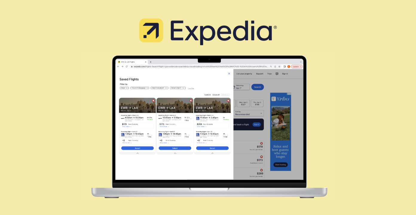
Expedia Save and Compare
Improving discoverability and helping users make faster, informed flight booking decisions.
The Challenge
Users often feel overwhelmed, lose track of their selections, and ultimately miss out on the best deals.
The Objective
How might we create a more intuitive flight comparison experience on Expedia, allowing users to seamlessly track and organize their travel choices without feeling overwhelmed or frustrated?
Timeline
4 Weeks
Role
UX/UI Designer
Skills/Tools
User Research, Journey Mapping, Prototyping, Usability Testing
The Problem
The Hidden Cost of Beauty
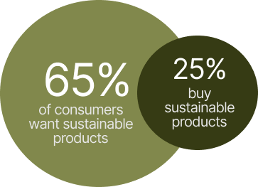
Consumers often overpurchase beauty and skincare products without understanding their environmental impact or actual necessity, leading to excessive waste and unsustainable production. Despite growing awareness about sustainability, people lack clear guidance to make mindful choices that align with their values and routines.
Solution
AI for Conscious Consumption
As a result, we designed a personalized AI system that helps users make conscious, eco-friendly purchases to reduce overconsumption and waste produced from beauty products.
Your very own beauty consultant
Get personalized insights regarding your purchasing habits and cosmetic products.
Jump to Final Design
Brainstorming
The prompt: design an ai powered app that helps users make more sustainable lifestyle choices
After receiving the prompt, we began by brainstorming various sustainable lifestyle choices through a quick mind mapping session. During our discussion, we were drawn to the issue of overconsumption, inspired by our own shopping habits and experiences. Further research revealed that overconsumption is a major contributor to waste production, reinforcing our decision to focus on this problem.

Discovery & Research
Understanding the problem space through user survey
Drawing on our initial observations, we sent out a user survey to examine individuals’ perspectives on product consumption, the factors influencing their purchasing decisions, and their sustainability mindset. We were able to receive 30 responses in total.
Target demographic: People ages 18 - 35
Target demographic: People ages 18 - 35
First, we found that most people over consume on skincare and makeup products which narrowed down our scope

At the same time, many people overlook how their consumption harms the environment, often tossing away products they don’t need

Yet, many are still influenced by social pressure from words of mouth and social media trends
While these factors exist, many people still want to make sustainable choices

Overconsumption behaviors directly contributes to negative impact on the environment
Then, we conducted additional research with Manus.AI Pro's advance research tool and learned that there are exisiting data that connects people's shopping habits with environmental issues.
The Intention-Action Gap Fuels a Massive Waste Crisis
Social Media Trends Directly Translate to Plastic Pollution

Environmental Impact:
Leads to 120 billion units of non recyclable cosmetic packaging produced annually
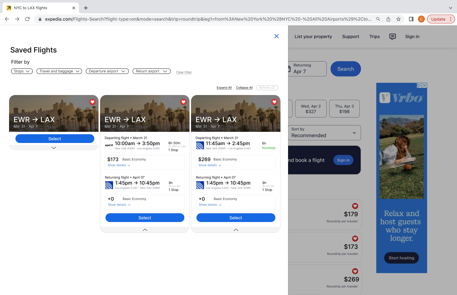
“It’s really annoying when I find a good flight, but then I can’t get back to it easily.”
“If I click away for even a second, I lose the flight I wanted and have to search all over again.”
“If I click away for even a second, I lose the flight I wanted and have to search all over again.”
Environmental Impact:
95% of beauty packaging thrown out after single use
Which contributes to 350 million tons of global plastic waste
Which contributes to 350 million tons of global plastic waste
“I just end up taking screenshots to remember which flights I liked.”
“I actually use Google Flights to compare, then come back to Expedia to book.”
“I actually use Google Flights to compare, then come back to Expedia to book.”
Key Findings
From our research, we narrowed things down to 3 key insights that guided how we designed our app.
1. The Sustainability Dilemma
People want to be sustainable, but costly or unclear “green” products create a gap between intentions, spending, and impact.
“I feel like I have 10 tabs open just trying to see which site has the best deal.”
“I have to check 3 or 4 other sites at the same time, otherwise I’m worried I’ll miss a better price.”
“I have to check 3 or 4 other sites at the same time, otherwise I’m worried I’ll miss a better price.”
2. Retail Therapy: A Quick Fix
Even with the best intentions, stress and overwhelm can trigger impulse buying. People need guidance to pause and make choices aligned with their values.
“It’s really annoying when I find a good flight, but then I can’t get back to it easily.”
“If I click away for even a second, I lose the flight I wanted and have to search all over again.”
“If I click away for even a second, I lose the flight I wanted and have to search all over again.”
3. The Social Pressure to Keep Up
In beauty, social media trends and influencers make us chase the next best thing. Most people just want to feel authentic, not trapped in endless cycle of buying.
“I just end up taking screenshots to remember which flights I liked.”
“I actually use Google Flights to compare, then come back to Expedia to book.”
“I actually use Google Flights to compare, then come back to Expedia to book.”
Therefore we concluded that
Problem Statement
Consumers often make impulsive purchases influenced by stress, social norms, or limited awareness, resulting in unnecessary products and significant packaging waste.
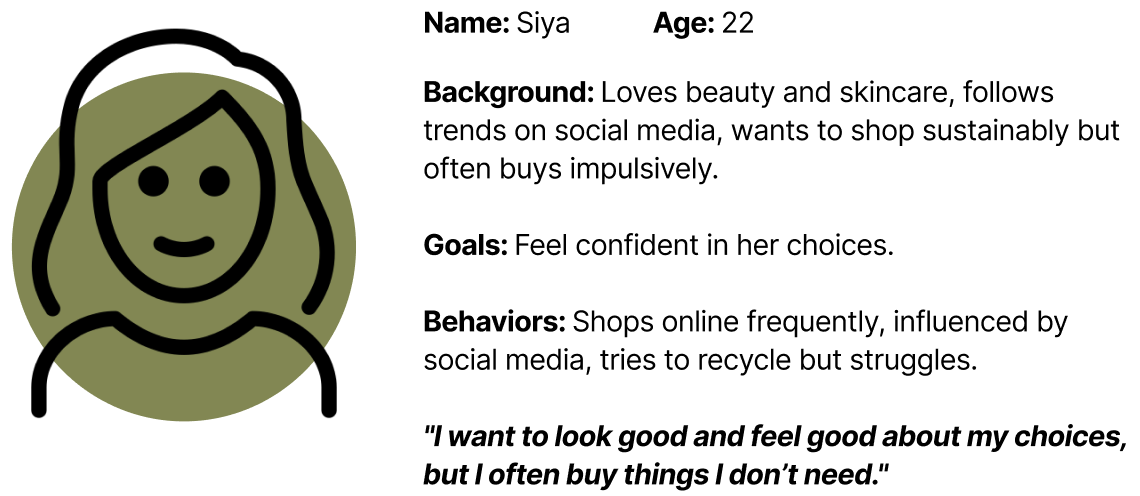
Defining Users
Who are we designing for?
We created a quick user persona to guide our ideation process. This allowed us to understand who our end users are and their needs.
Ideating
competitive analysis
We also drew inspiration from existing sustainability focused apps, such as Too Good To Go. We admired how they provide measurable impact, and we saw an opportunity to build on this by making the experience more personalized using AI-driven insights.
.png)
Information architecture
We then mapped out our core pages and features we wanted to implement.

Visualizing Ideas with Manus.AI
To help us iterate faster, we integrated Manus.AI into our workflow to bring our ideas to life. This was especially useful given our limited time, allowing us to quickly see how app screens, interactions, and user flows might function in real scenarios.
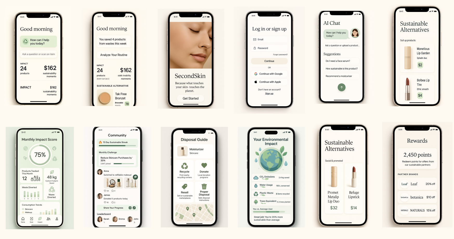
Final Design
Secondskin key features
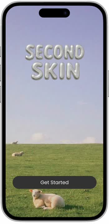
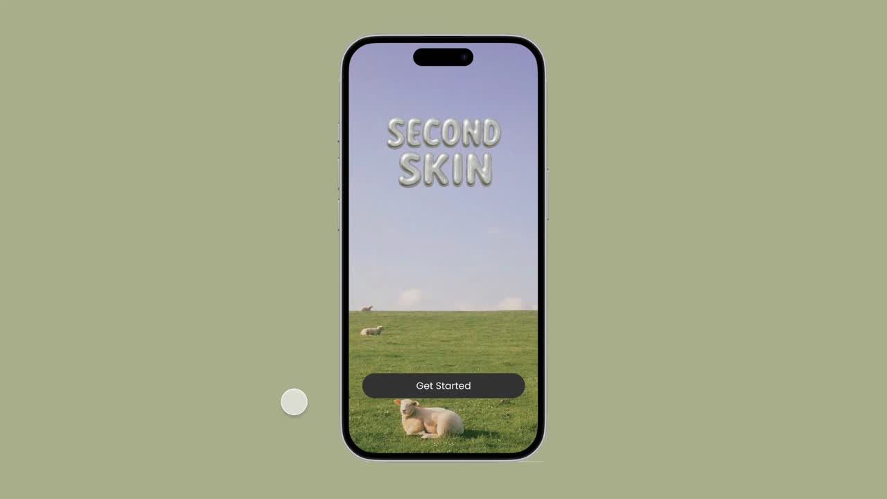
Welcome to SecondSkin
An app that guides you to make mindful choices that truly fit your needs.
An app that guides you to make mindful choices that truly fit your needs.
Meet Sage, your personal beauty consultant
Help track what you own, get personalized recommendations, and avoid buying products that don’t fit your routine.
Help track what you own, get personalized recommendations, and avoid buying products that don’t fit your routine.
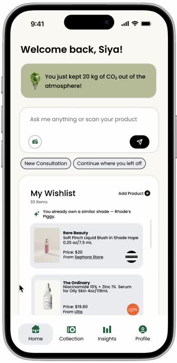
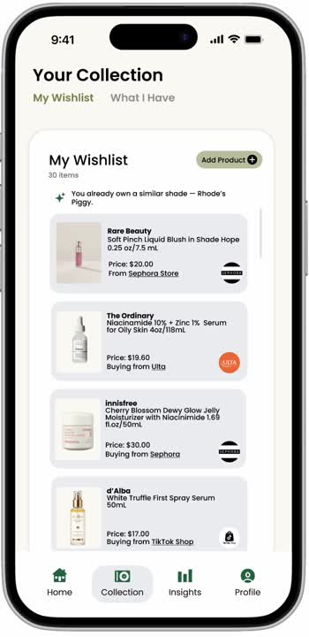
Share your existing collection
Sage can help you easily visualize what you own and what you want.
Sage can help you easily visualize what you own and what you want.
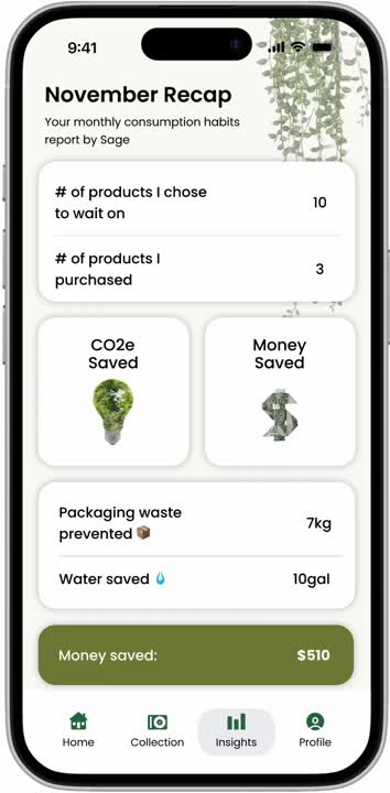
Know your impact
Turns your mindful choices into visible proof that your sustainability effort matters.
Turns your mindful choices into visible proof that your sustainability effort matters.

Build your personal profile
As your preferences evolve or seasons change, Sage adapts automatically, offering insights personalized just for you.
As your preferences evolve or seasons change, Sage adapts automatically, offering insights personalized just for you.
Next Steps
our impact
With our solutions, we hope our users will...

Make Mindful Choices
Reflect on their wants and needs to reduce overconsumption

Shop Sustainably
Choose products and brands that align with their eco-friendly values

Create Conscious Habits
Track their routines and collections to build intentional, environmentally responsible practices
Future Plan
If we were to expand on this app, we would add:
1. More Sustainability focused features: Explore adding tools like refill reminders, local recycling tips, or multi-use product suggestions.
2. Rewards system: Create an incentive program that rewards users for sustainable actions like finishing products, recycling packaging, or reducing monthly purchases with points that unlock discounts or eco-partner perks.
Reflection
What I learned
This project was my first experience building an AI-powered tool, and it was an incredible learning opportunity. Using Manus.AI allowed us to quickly synthesize research insights, identify patterns, and turn abstract ideas into testable mockups. It ultimately showed me how AI can accelerate the design process while still leaving room to incorporate emotional, human-centered aspects. I’m now more than ever excited to explore more ways to integrate AI into design and create new features/solutions.
The Problem
The Parent to Teen Financial Gap
Parents want to teach their teens how to manage money, but the conversations often end in frustration. Too much oversight feels controlling, too little feels risky. Teens want independence, but they’re anxious about making mistakes. I kept seeing this tension in my own family and in the world around me, so I set out to design a tool that could bridge that gap.


of parents open accounts primarily for education, not just transactions


of teens say they feel unprepared to finance their futures
The challenge became clear...
How might we help teens learn by doing while giving parents the peace of mind that their teens are supported, not left alone?
Solution
Turning everyday transactions into learning opportunities
I created a solution that turns everyday transactions into learning moments. Guided by Penni, a personalized in app assistant, teen users receive spending insights and goal based suggestions, while parents can still set account rules for added oversight and management.
1. Keep track and manage spendings

2. Get personalized advice and tips

3. Set tangible goals with guidance
Pennies will help set a healthy boundary that encourages growth and learning...
4. Parents set necessary limits

5. Mutual agreement of rules

And together, these features will create a feedback loop of trust and empowerment between both users groups.
Impact
Empowering Teens and Supporting Parents
Pennies helps teens take control of their money with easy-to-use saving and budgeting tools, while giving parents gentle oversight. The app reinforces healthy financial habits early, making learning money management simple, engaging, and lasting.
1. Teens gain confidence in managing money
Intuitive saving and budgeting tools help teens build practical financial skills
2. Parents guide without micromanaging
Insightful dashboards and notifications enable supportive oversight
3. Builds lasting financial habits
Goal guidance, rewards, and feedback encourage responsible money behavior early on
Discovery & Research
Understanding the problem
I spoke with five parent-teen pairs to understand where financial learning breaks down. What emerged was a shared sense of uncertainty:
1. Unsure how to teach financial skills effectively
2. Limited visibility into teen spending
3. Balancing control with independence
2. Limited visibility into teen spending
3. Balancing control with independence
Opportunity #1
1. Provide guided, age appropriate financial education tools for parents
2. Support gradual financial independence where teens earn autonomy step by step
3. Reinforce good habits with feedback
2. Support gradual financial independence where teens earn autonomy step by step
3. Reinforce good habits with feedback
1. Lack of financial education in school
2. Inconsistent income which makes makes planning and saving difficult
3. Difficulty separate needs from wants, leading to frequent impulse purchases
2. Inconsistent income which makes makes planning and saving difficult
3. Difficulty separate needs from wants, leading to frequent impulse purchases
Opportunity #2
1. Make saving feel tangible and rewarding
2. Increase awareness around spending decisions, distinguishing needs vs. wants
3. Support budgeting with flexible systems
2. Increase awareness around spending decisions, distinguishing needs vs. wants
3. Support budgeting with flexible systems
These conversations revealed two parallel needs: parents needed tools to guide without controlling, and teens needed support that felt empowering rather than punitive. This became the foundation for the design direction.
Market insight
Next, I analyzed competitors in the market to identify gaps that had not yet been addressed.
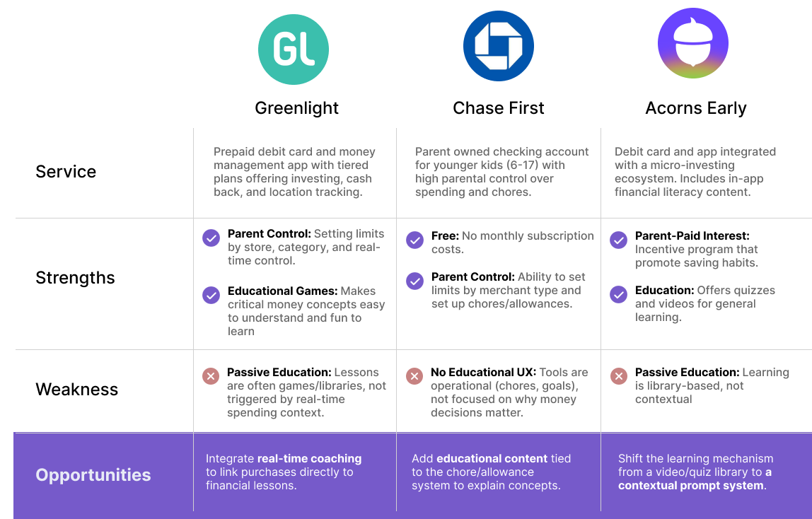
Market Gap:
Few offer personalized, real-time financial guidance that adapts to teens’ actual spending behaviors
Few offer personalized, real-time financial guidance that adapts to teens’ actual spending behaviors
Opportunity #3
Provide a personalized experience that gives real, actionable insights
Meeting the family
To keep the design grounded, I created two personas: A parent trying to teach responsibly without becoming “the bad guy,” and a teen eager for independence but unsure where to start.


Ideation
Defining the User Journey
Before designing screens, I mapped the ideal journey: a teen making everyday purchases, receiving gentle guidance, and gradually gaining autonomy while parents stay informed through lightweight oversight.
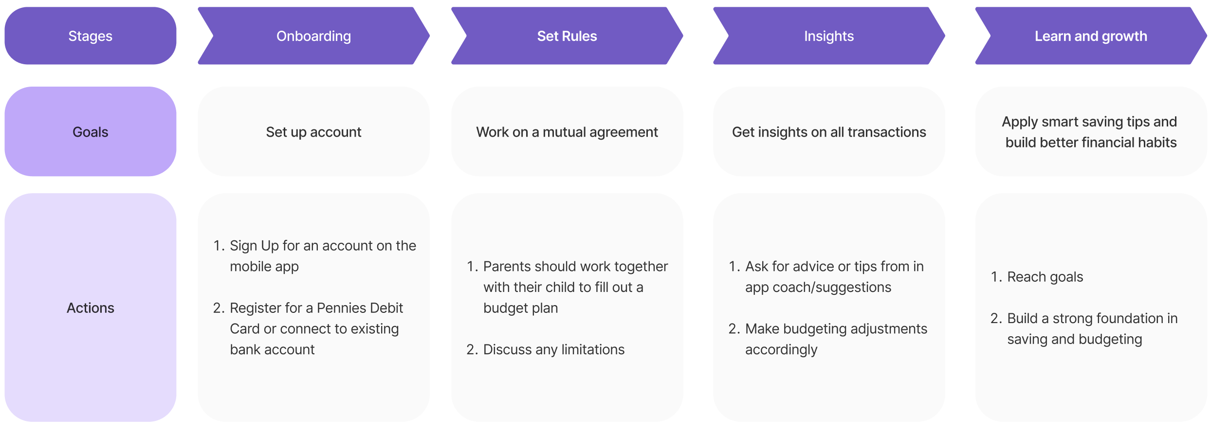
Secure payment method
To support this, I chose a prepaid card system. It’s widely used, secure, and gives parents the structure they need while giving teens the freedom they want.

Wireframing & Testing
1. Pivoting Toward Long Term Behavior Change
My first concept focused on real‑time “out of budget” alerts. Teens users ignored them. They felt punitive, not supportive.
This was a turning point. Instead of reacting to mistakes, the solution needed to guide teens users before the moment of purchase. This insight shifted the entire product toward proactive, goal‑driven learning.
This was a turning point. Instead of reacting to mistakes, the solution needed to guide teens users before the moment of purchase. This insight shifted the entire product toward proactive, goal‑driven learning.
.png)
.png)
2. Making Financial Insights Approachable
After the first round of testing, I created a higher fidelity prototype and ran quick tests on existing features. Some major iterations includes adding a spending patterns graph for teens and a friendly system that flags overspending trends while offering guidance rather than warnings.
.png)
3. Personalized Guidance Through a Friendly Character
Next, I introduced a character called Penni to make financial guidance feel more human, approachable, and engaging for teens. Instead of interacting with a generic AI chatbot, Penni offers a consistent personality and tone, helping users build trust and stay motivated. This shift transforms budgeting from something intimidating into a supportive experience, making financial learning feel less like a task and more like a conversation.
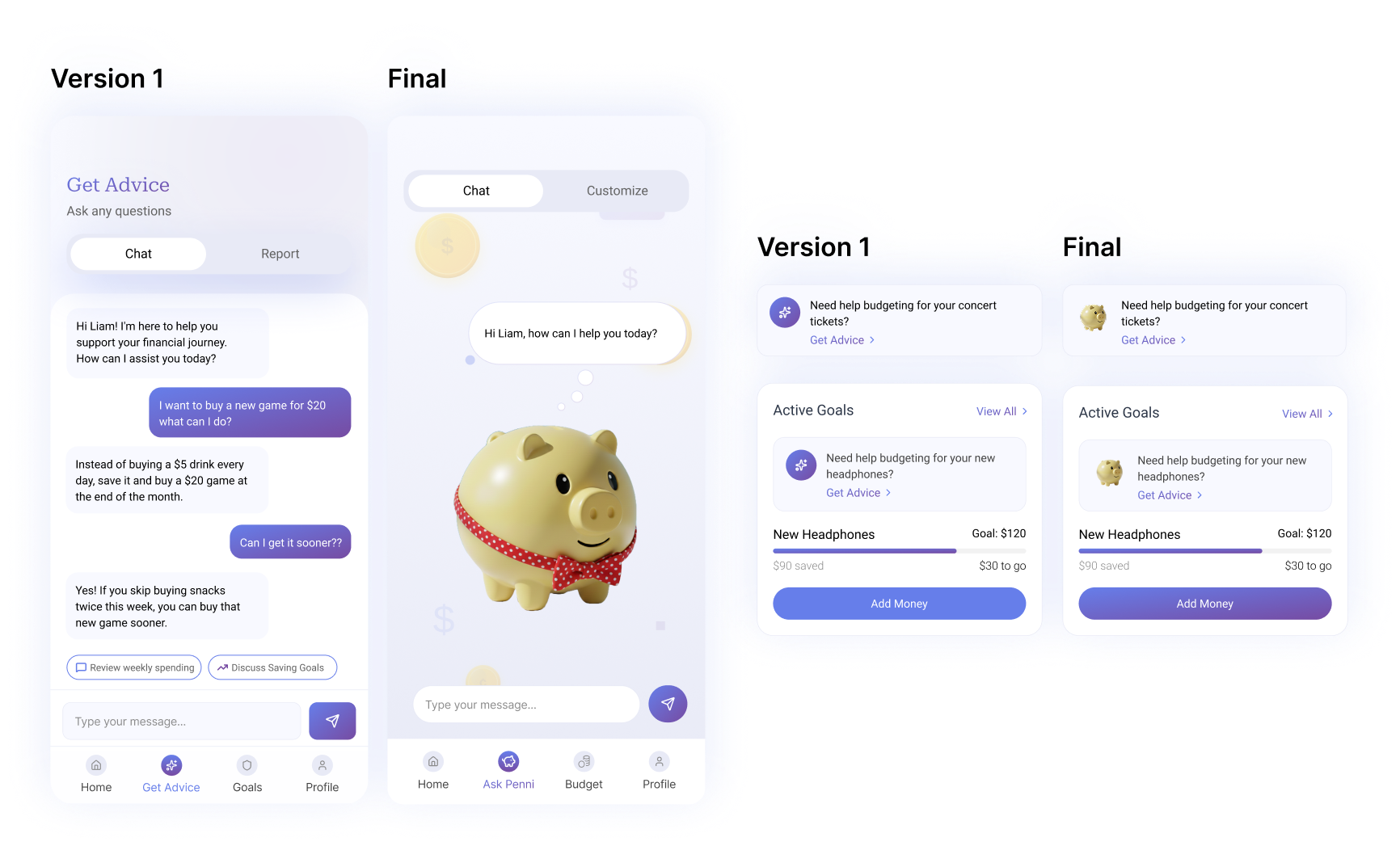
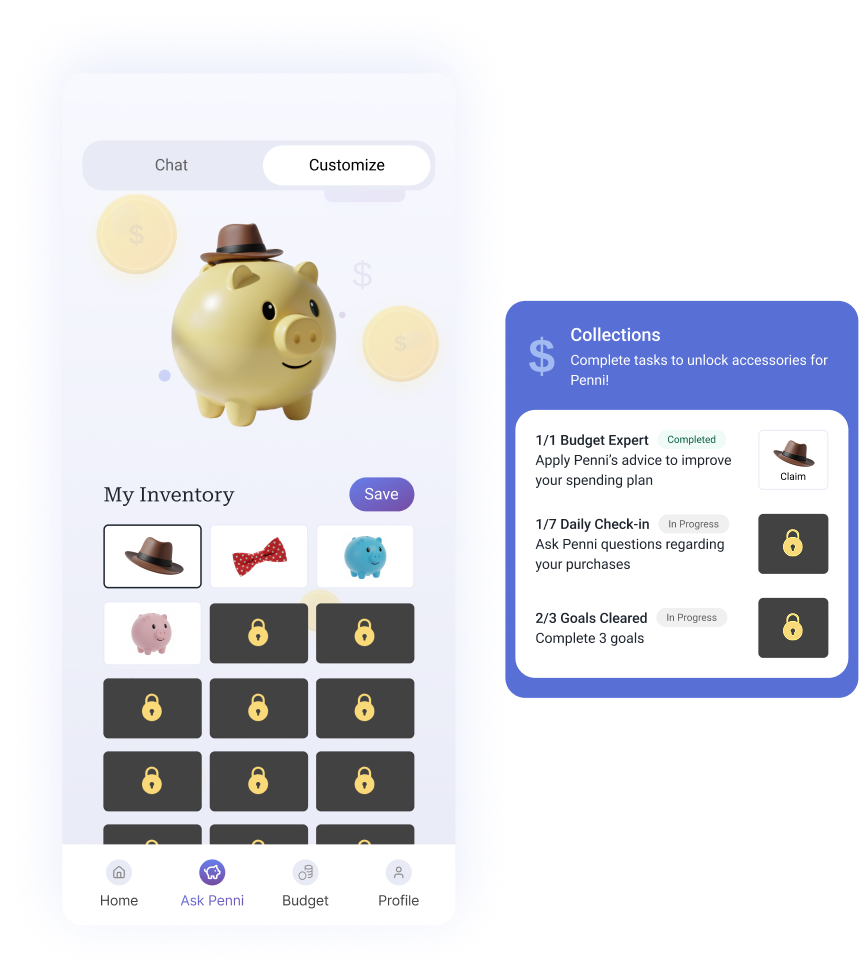
4. Unlocking Progress Through Incentives
Finally a major addition was a "Customize" feature, where teens can unlock fun accessories for Penni by completing tasks related to their account. This gamified approach encourages consistent engagement, turning financial management into a motivating and rewarding experience.
5. Accessibility check
Before finalizing the design, I audited the color palette and implemented a system to ensure all colors met WCAG accessibility standards. This review led to several key visual adjustments to improve contrast and readability.
.png)
Style Guide
Design system
For the high fidelity mockup, I created a design system as guidelines for my final design with a clear branding and ensuring that all the components are consistent throughout.
.png)
Final Design
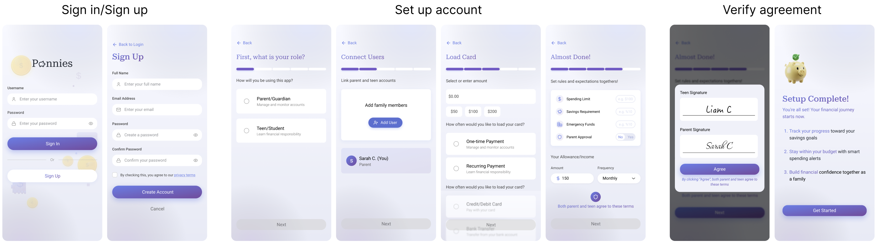
Onboarding
A simple sign up flow where both users get to discuss rules and restrictions together, signing a parent-teen agreement at the end.
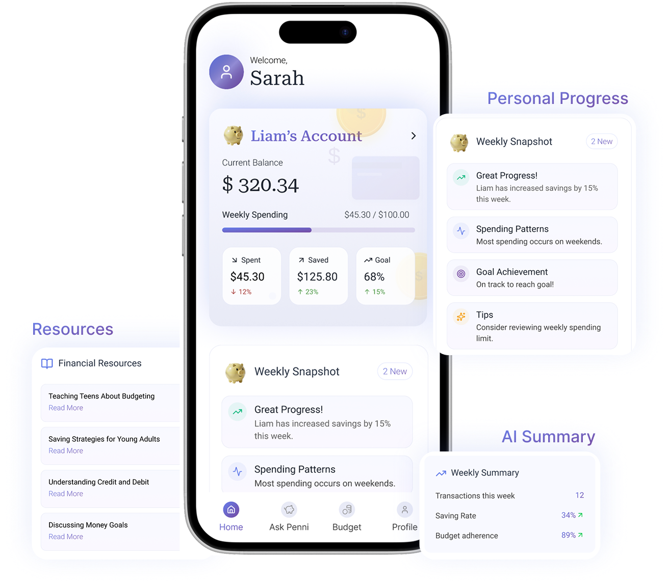
Home page
The homepage provides transaction overviews for both teens and parents, plus savings progress and tips for parents.
.png)
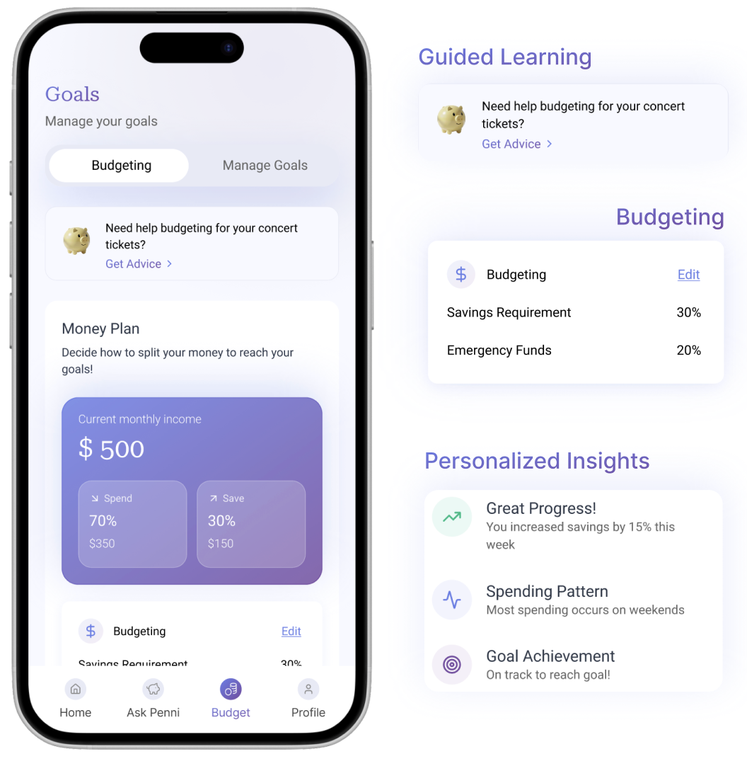
Customize, Ask, and apply
Teen users can customize, ask questions, and apply goals.

Unlock accessories by completing tasks and personalize their Penni.
Ask Penni questions, and through contextual AI, Penni provides personalized advice and insights to help reach goals.


Easily apply suggestions and set goals based on personalized recommendations.
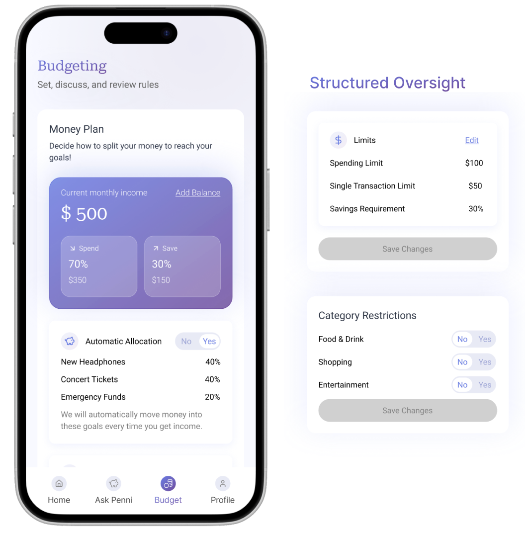
Budget
Budget tracking for teens, with parental spending controls.
Reflection
What I learned
This project pushed me to design for a user group I didn’t personally identify with. It taught me to validate assumptions, listen deeply, and design with empathy for both sides of a relationship.
Integrating AI meaningfully was another key learning. I focused on where AI could genuinely support learning and simplify complex concepts, rather than adding automation for its own sake.
Ultimately, Pennies taught me how to design for growth, trust, and shared understanding which are all values that continue to shape my work today.
The Problem
Rethinking Flight Comparison on Expedia
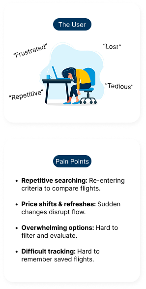
Expedia helps millions of travelers book flights every year, but the comparison experience falls short. Without a clear, intuitive way to evaluate options, users often feel overwhelmed, lose track of their selections, and ultimately miss out on the best deals.

Solution
Simplifying Flight Choices
Therefore, by introducing a streamlined flight-saving and comparison feature, it aimed to help users track options with ease.
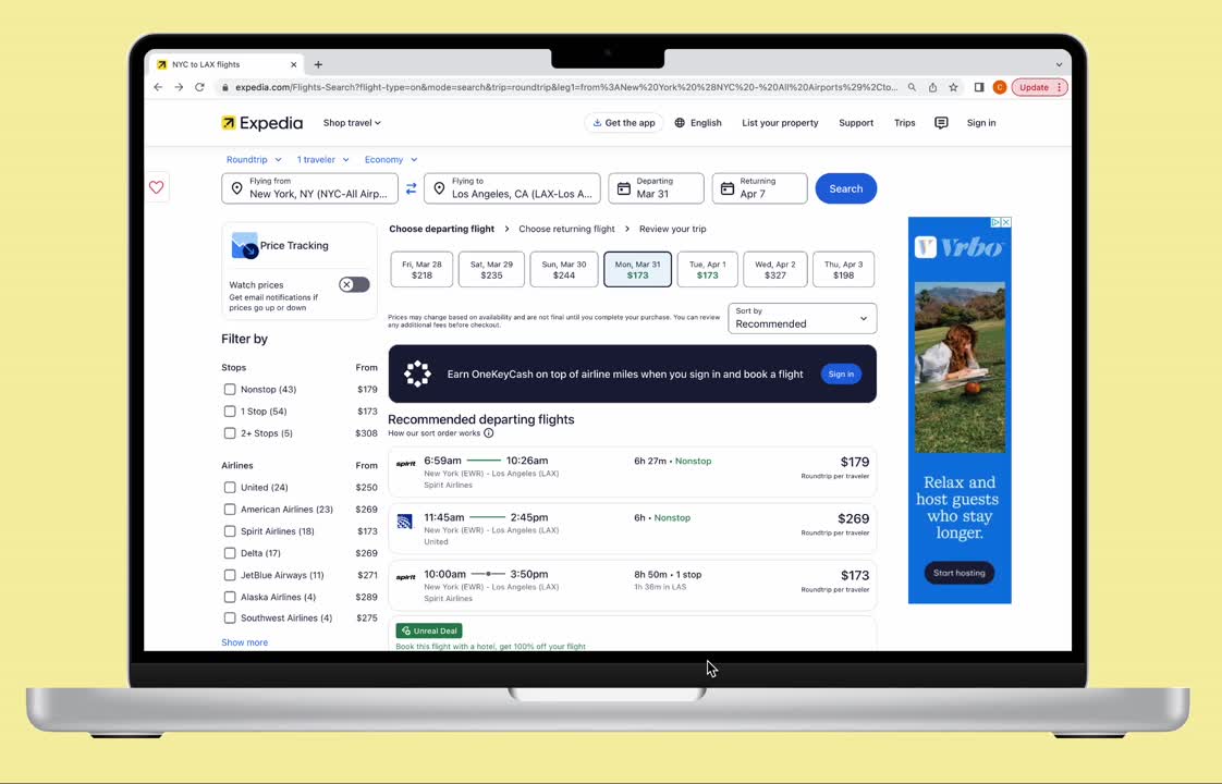
Browse and Safe Flights
A real-time flight saving feature for better decision making.
Jump to Final Design
Discovery & Research
Understanding the Problem
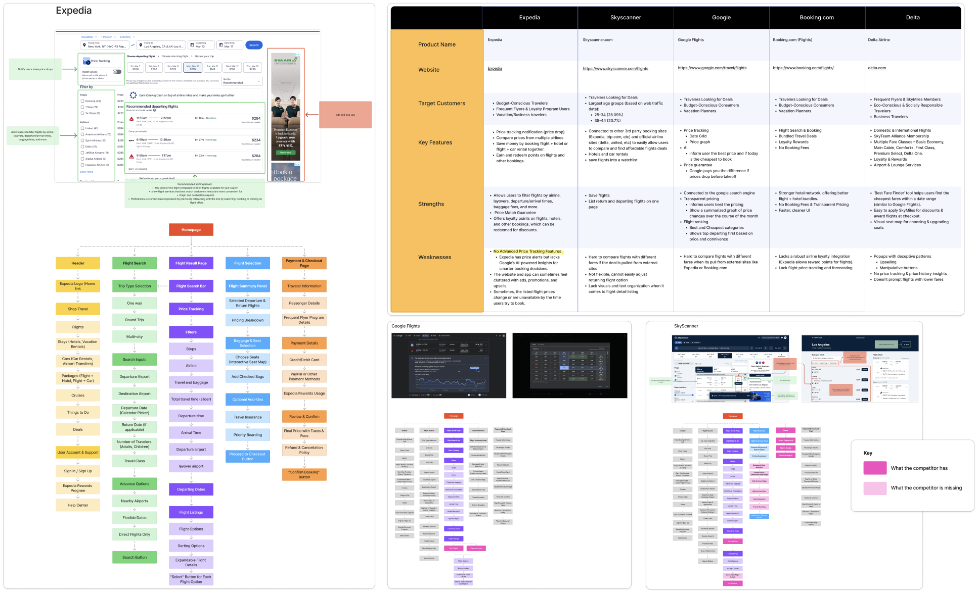
To start, in order understand the pain points and uncover opportunities for improvement, I mapped out a research plan that included user interviews and competitive analysis. I wanted to know:
1
How are users currently planning trips and comparing flights?
2
What are the frustrations they face when using Expedia to book their flights?
3
Why do they choose Expedia over other platforms?
User Interview Overview
I conducted 1:1 user interviews and send out surveys to the targeted users.
Demographic:
Current users aged 19-23
Looking for budget friendly flights
Demographic:
Current users aged 19-23
Looking for budget friendly flights
Research methodologies:

Key Findings
Multi-Tab Comparison
73%
use multiple tabs/sites to compare flights
(17 out of 23 survey respondents)
(17 out of 23 survey respondents)
Losing Track of Flights
81%
reported difficulty returning to a flight
(9 out of 11 interviews)
(9 out of 11 interviews)
External Tools Usage
57%
rely on external tools to save or compare
(13 out of 23 survey respondents)
(13 out of 23 survey respondents)
Insight 1
Users often have multiple tabs open and switch between sites to compare prices and options.
“I feel like I have 10 tabs open just trying to see which site has the best deal.”
“I have to check 3 or 4 other sites at the same time, otherwise I’m worried I’ll miss a better price.”
“I have to check 3 or 4 other sites at the same time, otherwise I’m worried I’ll miss a better price.”
Insight 2
Once they find a flight they like, it can be difficult to return to that specific option after navigating away from the page.
“It’s really annoying when I find a good flight, but then I can’t get back to it easily.”
“If I click away for even a second, I lose the flight I wanted and have to search all over again.”
“If I click away for even a second, I lose the flight I wanted and have to search all over again.”
Insight 3
Many users resort to external tools like Google Flights, notes apps, or screenshots to compare flights.
“I just end up taking screenshots to remember which flights I liked.”
“I actually use Google Flights to compare, then come back to Expedia to book.”
“I actually use Google Flights to compare, then come back to Expedia to book.”
Therefore...
Problem Statement
How might we create a more intuitive flight comparison experience on Expedia, allowing users to seamlessly track and organize their travel choices without feeling overwhelmed or frustrated?
Defining Users
Who are we designing for?
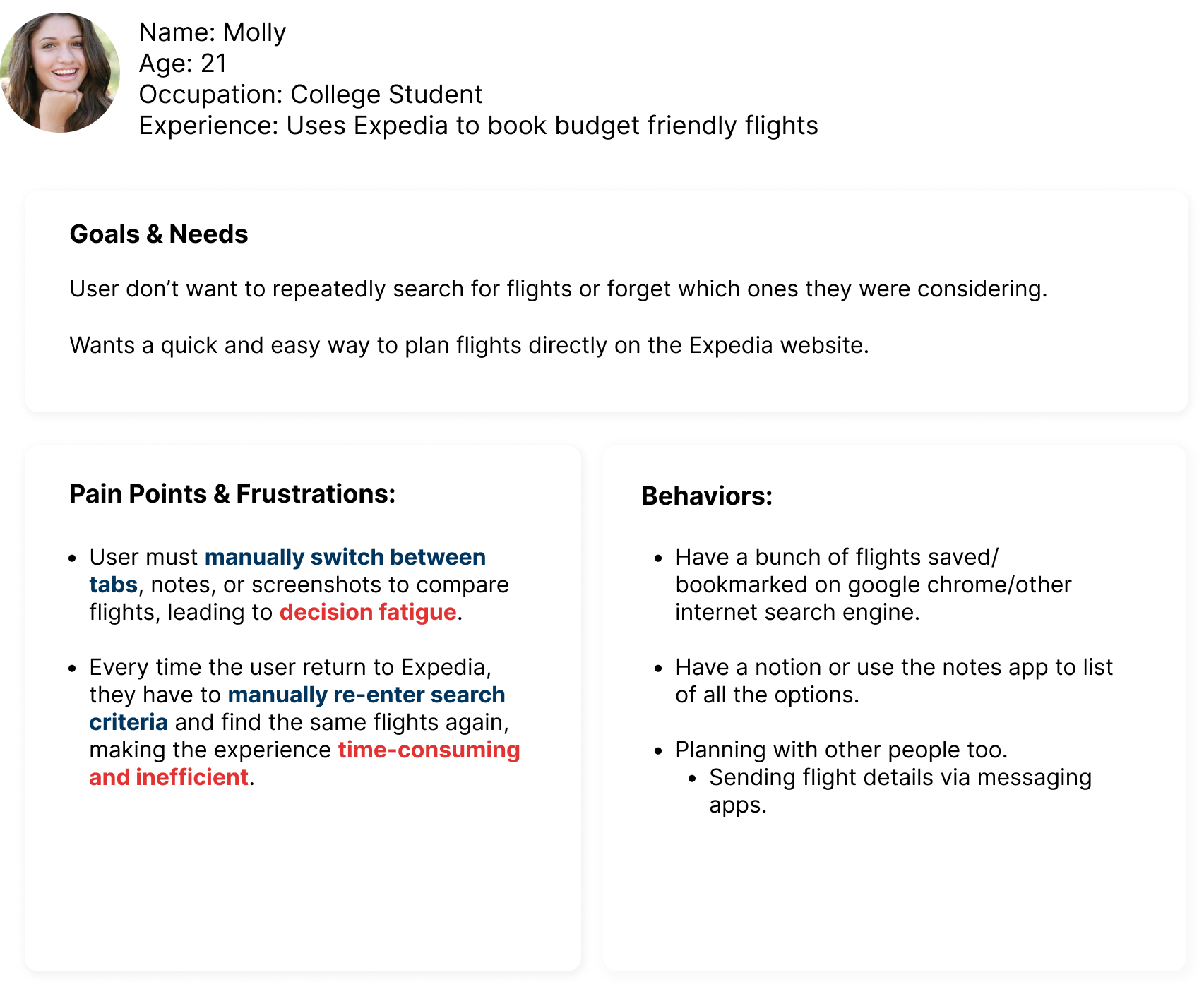
Before going into brainstorming solutions, I created a user persona to understand our target user based on insights from the initial user research. Meet Molly, a college student who is interested in quickly finding budget friendly flights that matches with her travel plans.
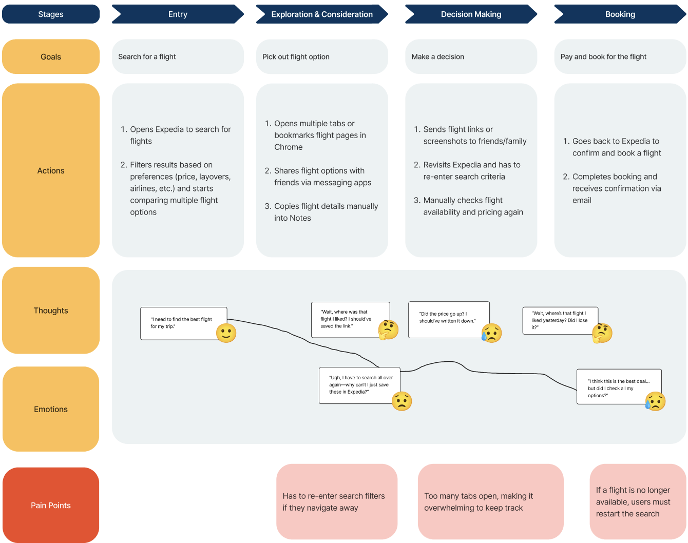
Journey mapping
In addition to a user persona, I mapped out what Molly potentially says, thinks, feels, and does during the flight search process. The key here to is identify the low points and pain points along the way.
Ideating
what can expedia do to stand out and fit market needs?
From looking at different flight booking platforms, I learned that there's an increasing emphasis on seamless flight comparison, price tracking, and user-friendly interfaces without overwhelming upsells or redirection.
Therefore, top platforms like Google Flights, that can balance affordable, competitive pricing with organized, transparent flight details are well-positioned to attract and retain users.
Therefore, top platforms like Google Flights, that can balance affordable, competitive pricing with organized, transparent flight details are well-positioned to attract and retain users.
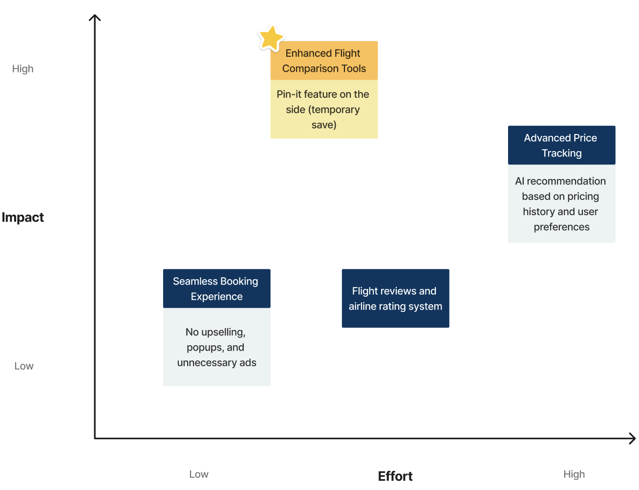
Looking for the best option
With the insights in hand, I began brainstorming solutions to improve the flight comparison process on Expedia. The key challenge was to create a feature that allowed users to evaulate flights options seamlessly without disrupting their workflow.
I explored multiple options, including:
- Flight Comparison Tool: A built-in tool to compare flights side-by-side.
- Price Alerts: Notifications when prices changed.
- Rating System: Helps users spot top rated flights quickly.
I explored multiple options, including:
- Flight Comparison Tool: A built-in tool to compare flights side-by-side.
- Price Alerts: Notifications when prices changed.
- Rating System: Helps users spot top rated flights quickly.
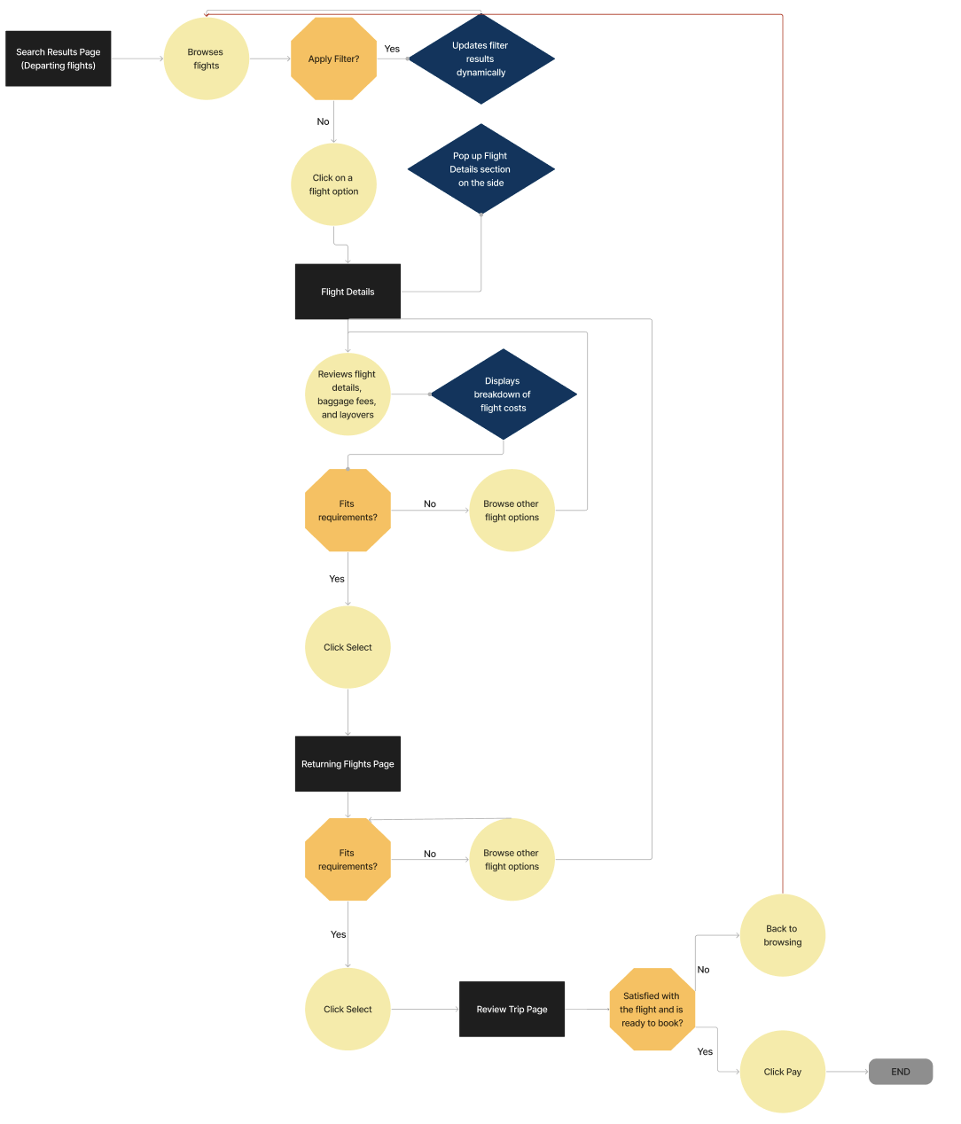
Envisioning the New User Flow
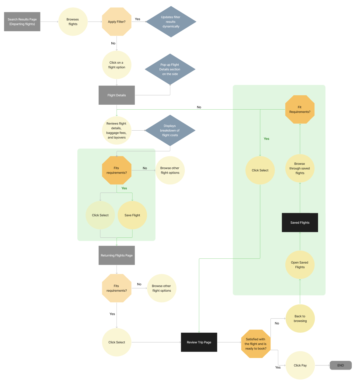
Then I reimagined the user flow with the new feature and how it would help minimalize the frustration of going back to the beginning of the search process.
With the new “Pin It” feature:
- Users can save and pin flights directly during the search process.
- After navigating through different stages of the site, users can access their pinned flights list and compare options easily without losing track of previous selections.
With the new “Pin It” feature:
- Users can save and pin flights directly during the search process.
- After navigating through different stages of the site, users can access their pinned flights list and compare options easily without losing track of previous selections.
Before
After
Wireframing & User Testing
Initial Wireframes And user Testing
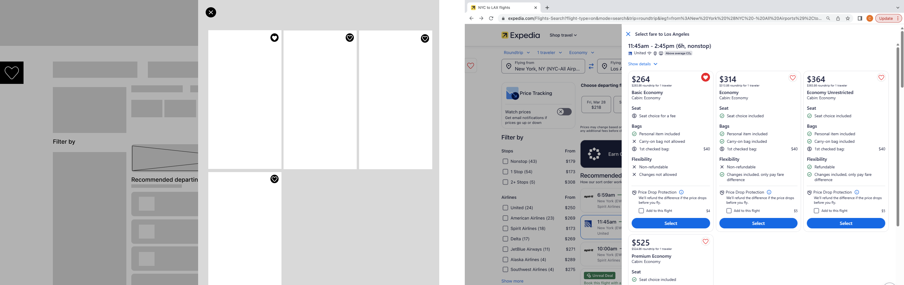
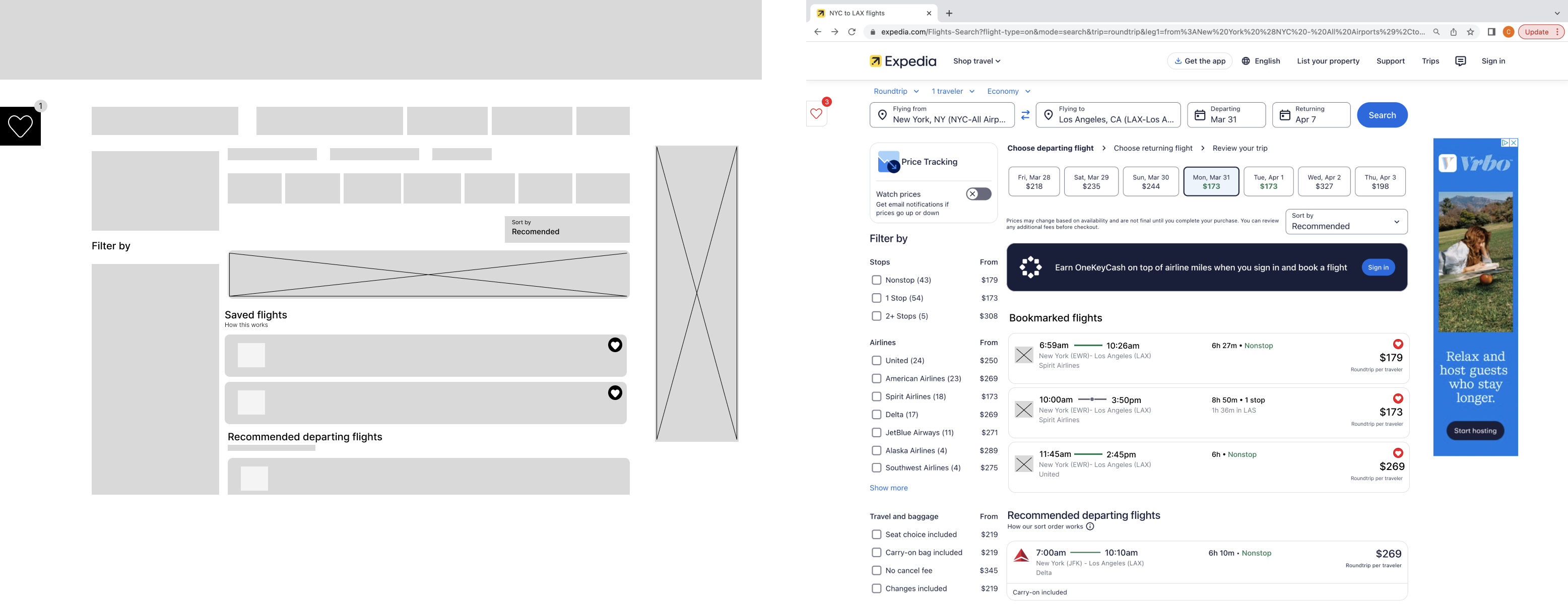
Before moving on to digital wireframes, I quickly sketched out some low-fidelity paper wireframes that showcased how the “Pin It” feature would integrate into the flight search experience. This way I can get quickly get ideas out receive some initial feedback before building the design on Figma.
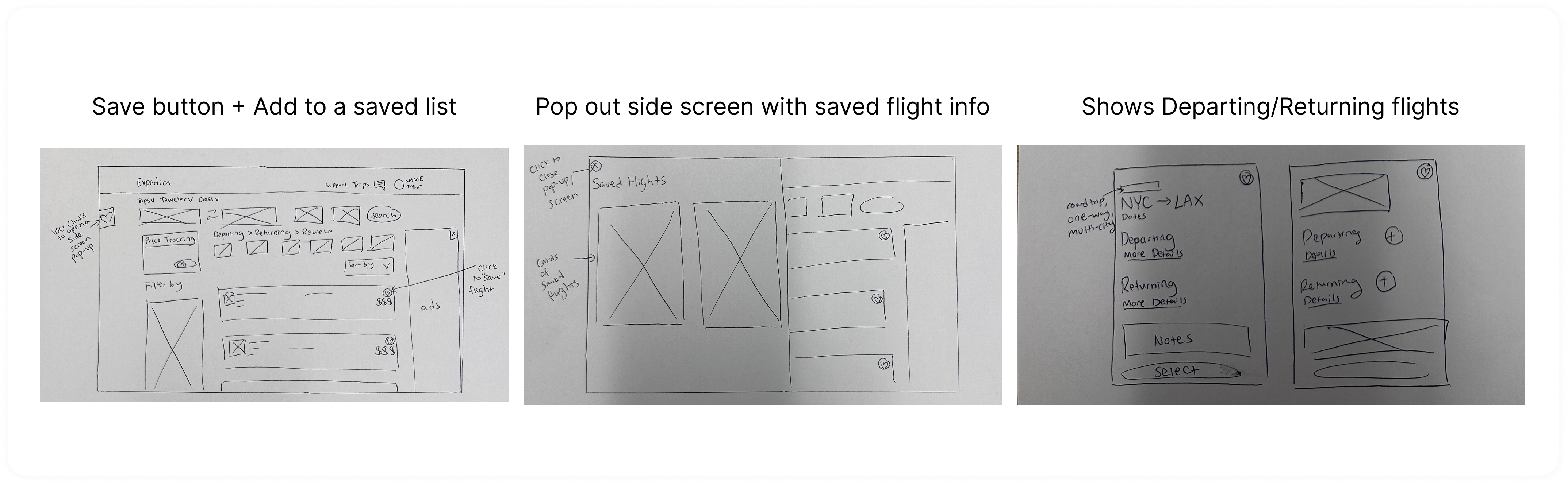
After going through a quick round of user feedback, these are the UI changes made to the initial lo-fi wireframes.
Before
After

Transitioning from Mid-fi to Hi-fi

Reflection
What I learned
1. Testing Early: Rapid prototyping and user feedback helped me refine the interface especially around visibility, usability, and how comparison data was displayed.
2. Iterating with Constraints in Mind: Working within Expedia’s existing design system taught me how to ideate creatively while respecting branding, UI consistency, and technical feasibility.
3. Scoping for MVP: I practiced scoping features for a minimum viable product, prioritizing functions that solve the core user problem while leaving room for future enhancements.
The Problem
The Parent-Teen Financial Gap
Many youth banking apps struggle to strike the right balance between independence and guidance. They often end up being either too limiting or too simplistic, creating friction for both parents and teens in managing money together.
Solution
Personalized, Guided Learning
Therefore, by introducing a streamlined flight-saving and comparison feature, it aimed to help users track options with ease.
Browse and Safe Flights
A real-time flight saving feature for better decision making.
Jump to Final Design
Discovery & Research
Understanding the Problem
I started off with 5 pairs of parent-teen groups to understand their struggles. Then, based on the insights, I mapped out the key friction points across both user groups.
1
How are users currently planning trips and comparing flights?
2
What are the frustrations they face when using Expedia to book their flights?
3
Why do they choose Expedia over other platforms?
Therefore...
Problem Statement
How might we bridge the financial gap between parents and teens, empowering teens to learn by doing, while giving parents peace of mind?
Defining Users
Meeting the Family
Then to clarify who our targeted users are I created two primary personas who represent the core conflict.
Ideating
Design Challenge: Teaching “Opportunity Cost”
Our central design moment focused on how Liam learns from an impulsive purchase.
The user flow explored how a real-time AI pop-up could turn that transaction into a short, meaningful teaching moment to help Liam reflect, while notifying Sarah to discuss it later.
The user flow explored how a real-time AI pop-up could turn that transaction into a short, meaningful teaching moment to help Liam reflect, while notifying Sarah to discuss it later.
Information Architecture: Separate but Connectedking for the best option
To support dual roles, I created a role-based IA, ensuring parents and teens had distinct yet interconnected dashboards.
Parent side: oversight, limits, and AI insights.
Teen side: spending, AI guided learning, and growth tracking.
Parent side: oversight, limits, and AI insights.
Teen side: spending, AI guided learning, and growth tracking.
Wireframing & User Testing
Initial Wireframes And user Testing
Reflection
What I learned
1. Testing Early: Rapid prototyping and user feedback helped me refine the interface especially around visibility, usability, and how comparison data was displayed.
2. Iterating with Constraints in Mind: Working within Expedia’s existing design system taught me how to ideate creatively while respecting branding, UI consistency, and technical feasibility.
3. Scoping for MVP: I practiced scoping features for a minimum viable product, prioritizing functions that solve the core user problem while leaving room for future enhancements.
2. Iterating with Constraints in Mind: Working within Expedia’s existing design system taught me how to ideate creatively while respecting branding, UI consistency, and technical feasibility.
3. Scoping for MVP: I practiced scoping features for a minimum viable product, prioritizing functions that solve the core user problem while leaving room for future enhancements.
The Problem
Low Engagement Despite Interest
Although TikTok Shop has seen success with deals and affordable pricing, only 29% of weekly users have made a purchase. Meanwhile, 26% are interested but have not made a purchase, revealing a crucial gap between interest and action.
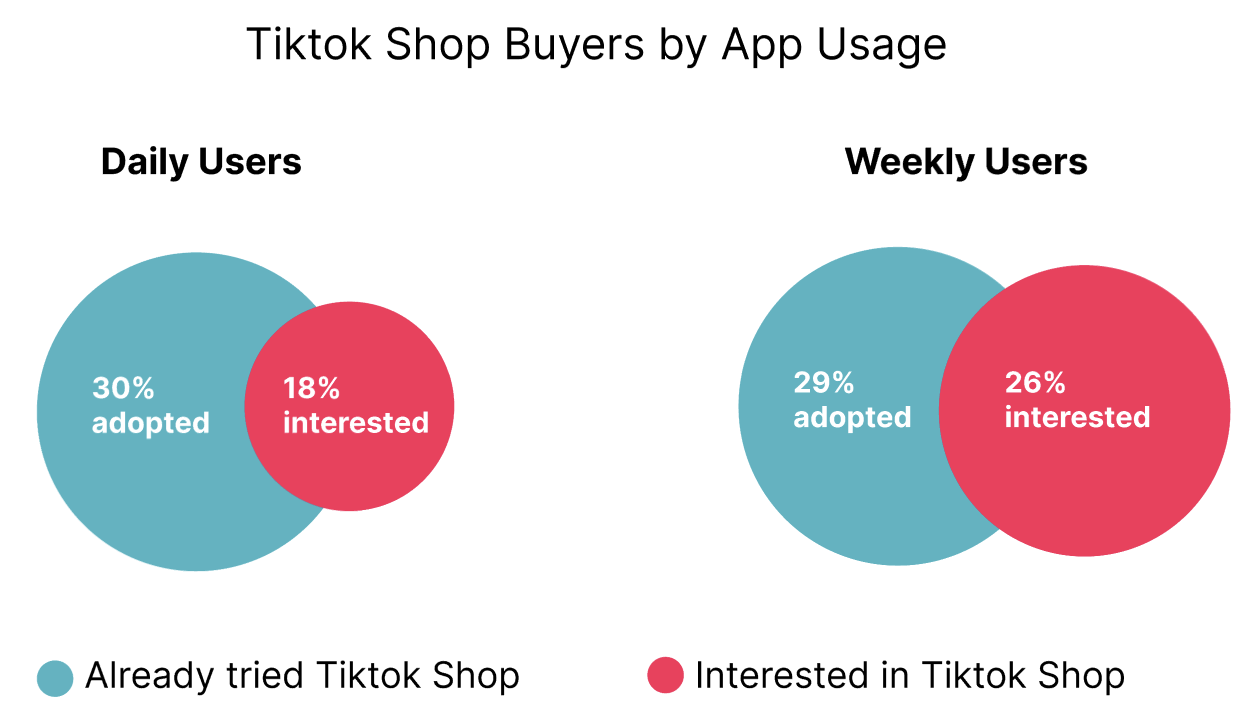
This hesitation presents both a trust barrier and a missed opportunity for TikTok to convert engaged users into active buyers.
User Research
User Interview Findings
So to understand what drives user behavior, we conducted interviews with both existing TikTok users and newcomers to TikTok Shop. Our goal was to uncover pain points that prevent or disincentivize users from making purchases.
Here are some key takeaways:
Existing Brand Loyalty:
Many users are already loyal to platforms and stores they frequently shop from.
Social Proof & Trust:
Users expressed hesitation due to a lack of social proof. Since they don’t know anyone who uses TikTok Shop, they see no compelling reason to try it.
Membership & Perks:
Users would use the same platforms because they see value in loyalty programs and memberships.
Quote Highlight:
“I like scrolling through TikTok, but I’ve never actually bought anything from the Shop. It doesn’t feel trustworthy yet.” — Interview participant
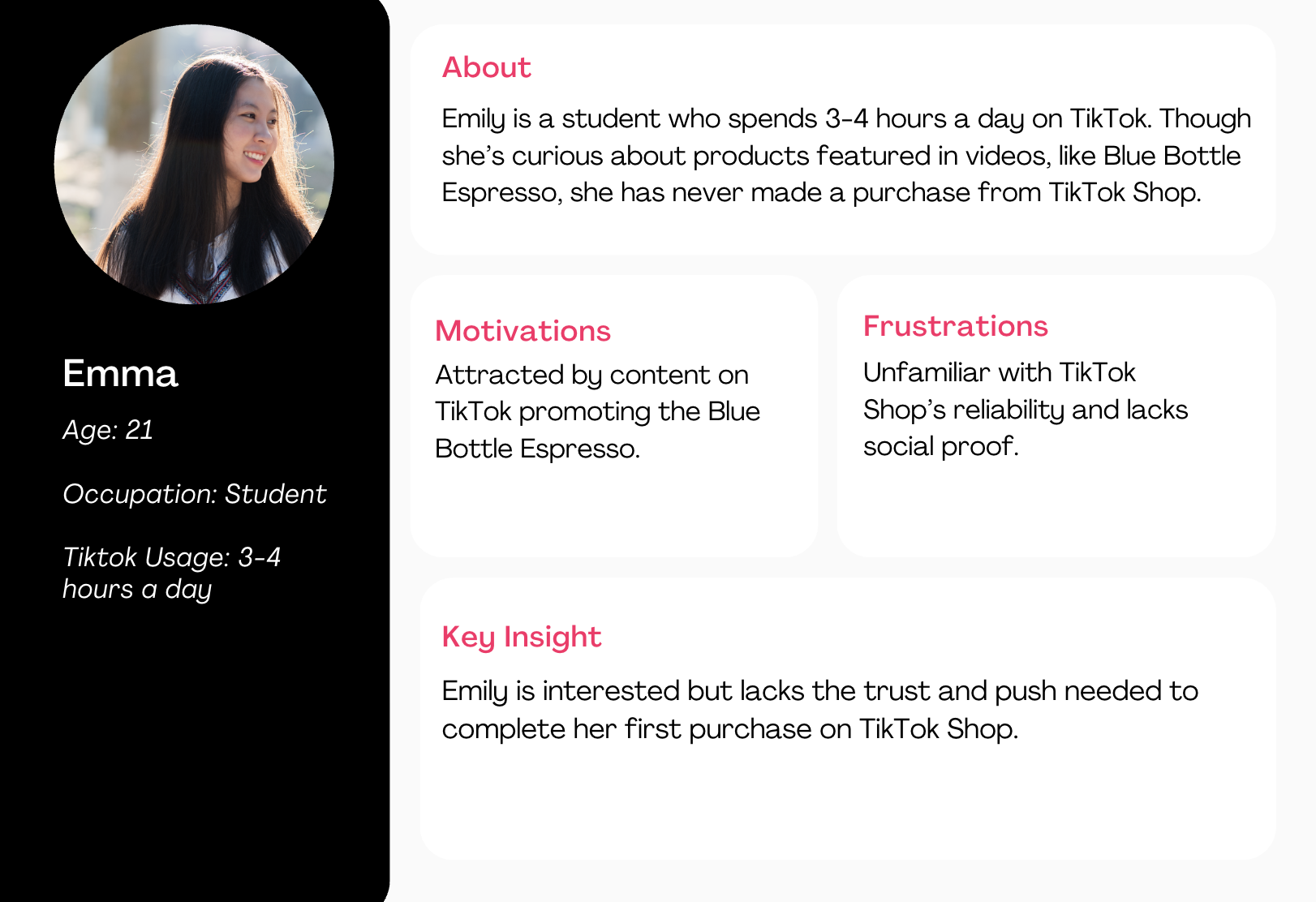
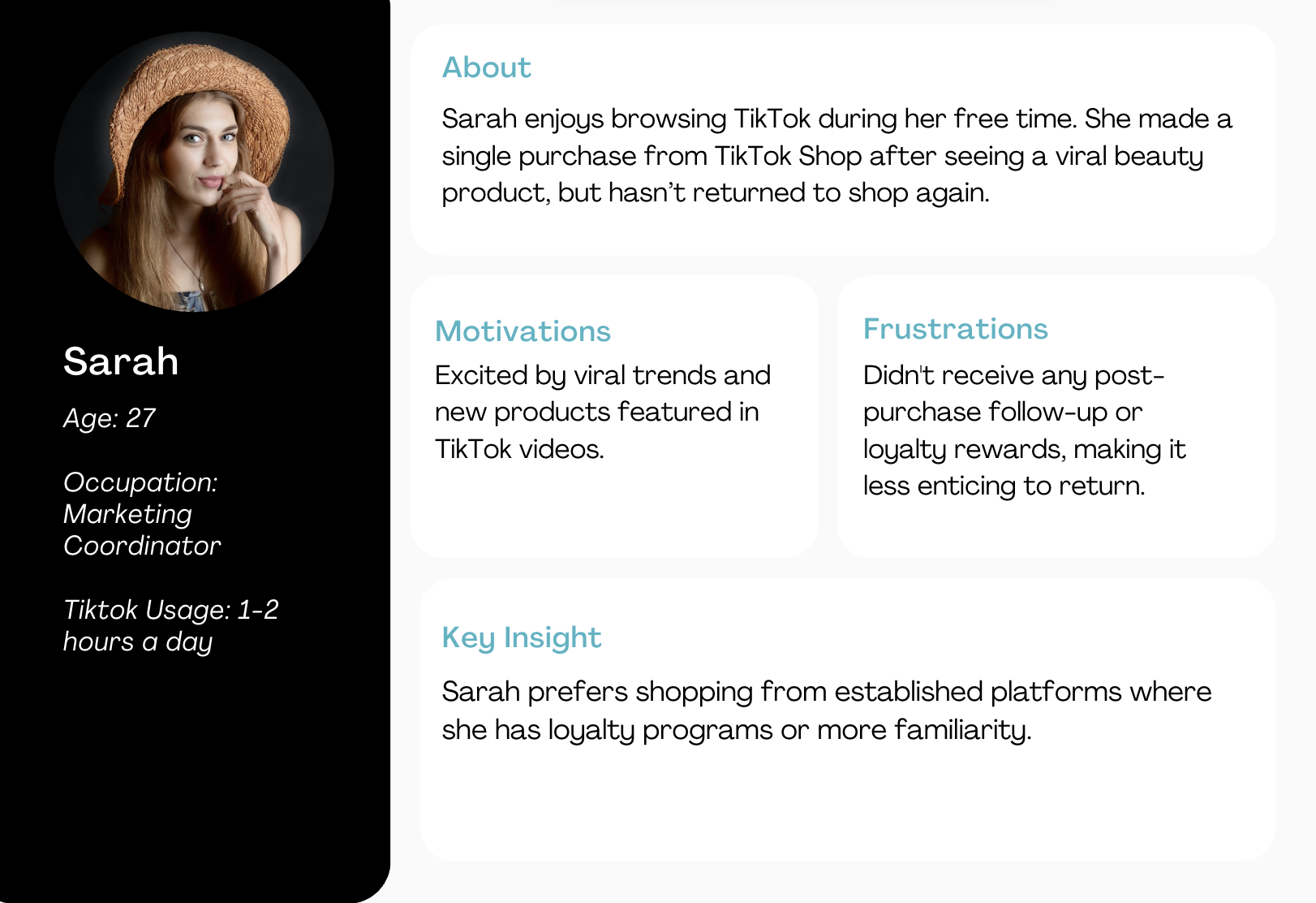
User personas
Then, based on interview data and behavioral trends, we identified two key personas:
Curious Customer:
Returning Buyer:
Competitive analysis: What Keeps Customers Coming Back?
Building on our user personas, we explored what keeps customers coming back to other successful e-commerce platforms. Beyond the typical use of coupons and discounts, we found that many brands rely on rewards programs and loyalty systems to drive customer retention and incentivize repeat purchases.
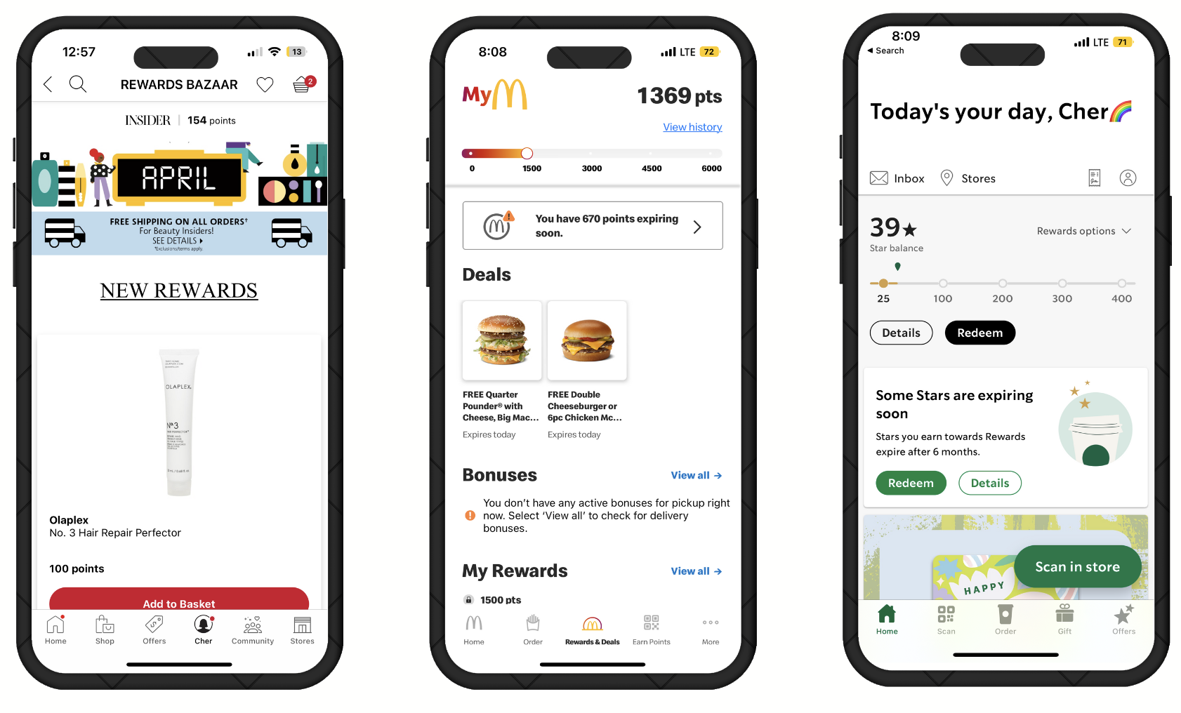
We studied reward systems in apps like Sephora, Mcdonalds, and Starbucks. Common retention strategies included:
Points per purchase
Social Proof & Trust
Membership & Perks
First-time buyer rewards
💡 Key Insight: Trust and Loyalty Are the Biggest Drivers of Conversion
Users are unlikely to make the switch unless TikTok Shop delivers personalized value and a sense of trust. Without recognizable benefits or confidence in the platform, there’s little motivation for users to take action.
🤔 Which leads to the question...
How might we build trust on Tiktok shops, driving increased customer retention rates and attracting new customers?
Ideation
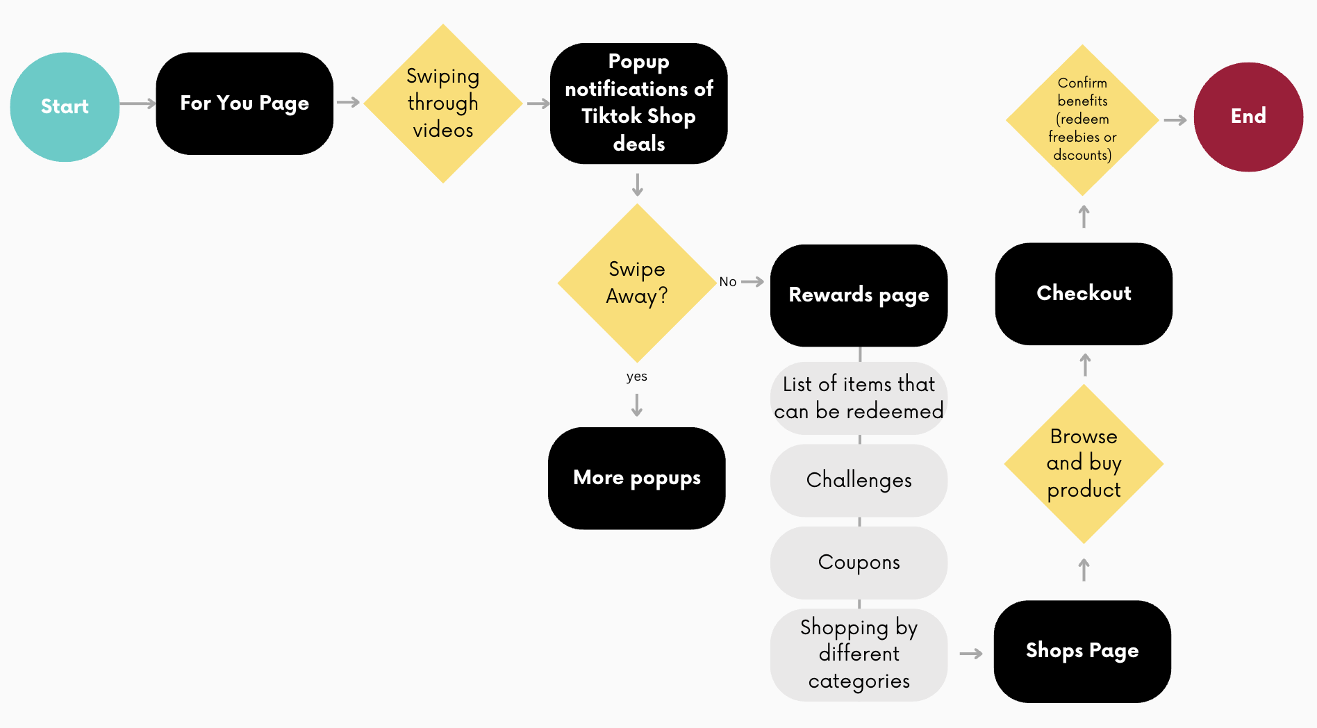
Integrating a Reward System into TikTok Shop
To bring our concept to life, we mapped out a user flow that demonstrates how a reward system could be seamlessly integrated into the TikTok Shop experience. The flow highlights how the system would be:
- Introduced to users
- Reinforced through repeat actions
- Used to build loyalty over time
- Introduced to users
- Reinforced through repeat actions
- Used to build loyalty over time
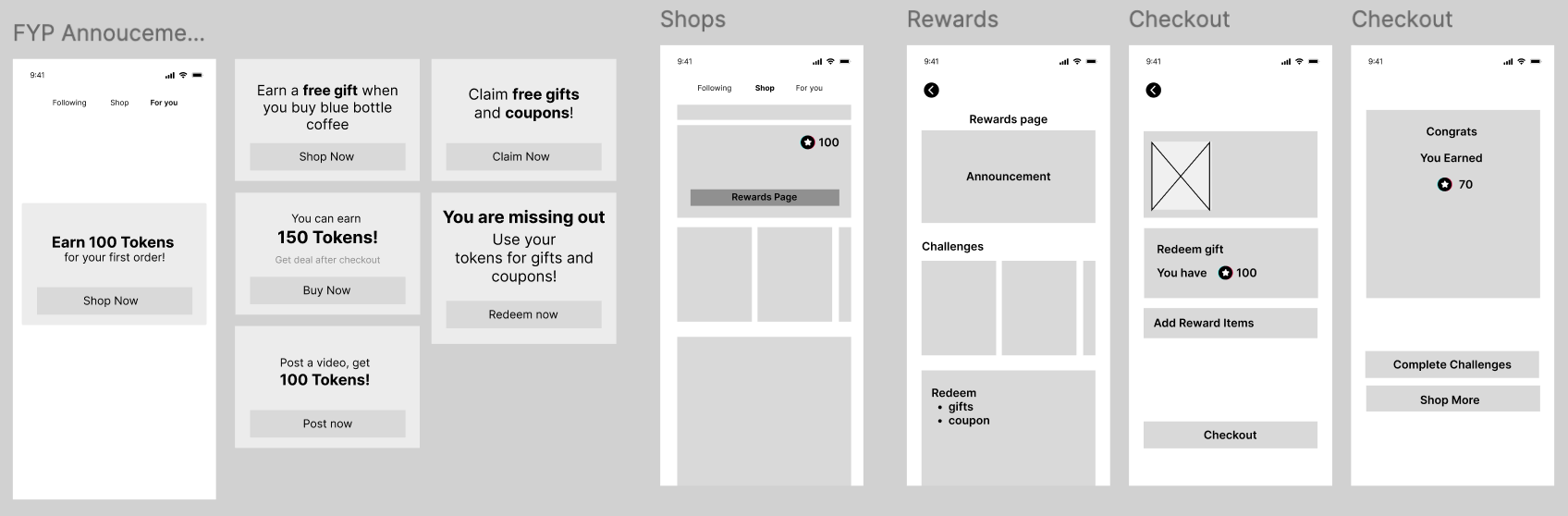
Wireframing
Low fidelity wireframes
To quickly explore and communicate our ideas, we created a set of low-fidelity wireframes in Figma. Key elements include:
- Onboarding moments where the reward system is introduced to users
- Incentive touchpoints that encourage repeat purchases (e.g. points tracker, progress bars)
- Loyalty dashboard allowing users to track and redeem their rewards
- Onboarding moments where the reward system is introduced to users
- Incentive touchpoints that encourage repeat purchases (e.g. points tracker, progress bars)
- Loyalty dashboard allowing users to track and redeem their rewards
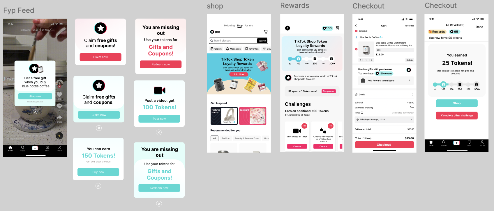
Working Prototype #1
This interactive version allowed users to experience key features such as earning points, tracking progress, and redeeming rewards.
To evaluate its effectiveness, we conducted a formal round of usability testing with participants from our target user groups assessing:
- Clarity of how the rewards system is introduced
- Ease of navigation through the rewards interface
- User motivation to engage with the system repeatedly
To evaluate its effectiveness, we conducted a formal round of usability testing with participants from our target user groups assessing:
- Clarity of how the rewards system is introduced
- Ease of navigation through the rewards interface
- User motivation to engage with the system repeatedly
Usability Testing
Testing results and iterations
Here are some key pivots/changes we made according to the user test:
Feedback #1: "The Pop-Ups makes it feel like a scam!”:
Before
20%
Clicked on the popup
After
50%
Clicked on the popup
Subtle Reward Reminders on FYP:
-> Replaced intrusive pop-ups with a subtle announcement screen
-> Periodically featured on the For You Page (FYP)
-> Replaced intrusive pop-ups with a subtle announcement screen
-> Periodically featured on the For You Page (FYP)
Feedback #2: Prioritizing Buttons
Before
50%
Interacted with Rewards
After
80%
Interacted with Rewards
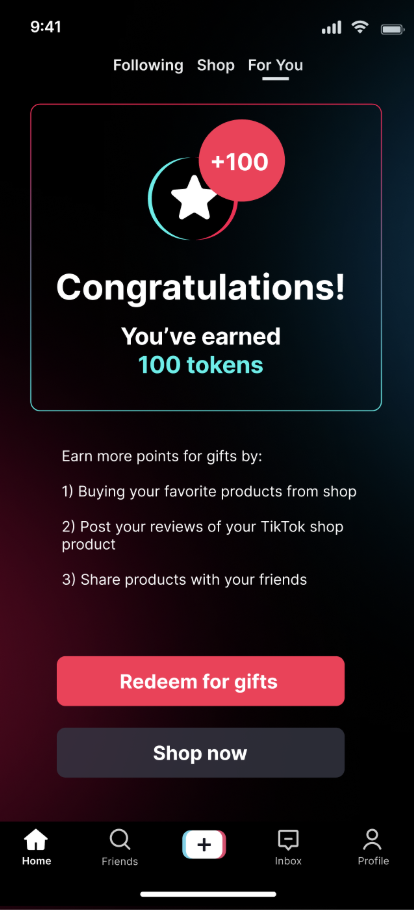
UI Design + Button Change:
-> Prioritize the “Earn Token” button instead of the “Shop now”
-> Consolidating the UI design to get key information across
-> Prioritize the “Earn Token” button instead of the “Shop now”
-> Consolidating the UI design to get key information across
Result
Success?
Our approach showed positive results, as shown by the following user feedback:
80%
Expressed interest in the rewards system
70%
Bought a product because of the rewards feature
Therefore, we ultimately achieved our goals by:
1. Hooking users in and discovering Tiktok Shop
2. Encouraging users to make their first purchases
1. Hooking users in and discovering Tiktok Shop
2. Encouraging users to make their first purchases
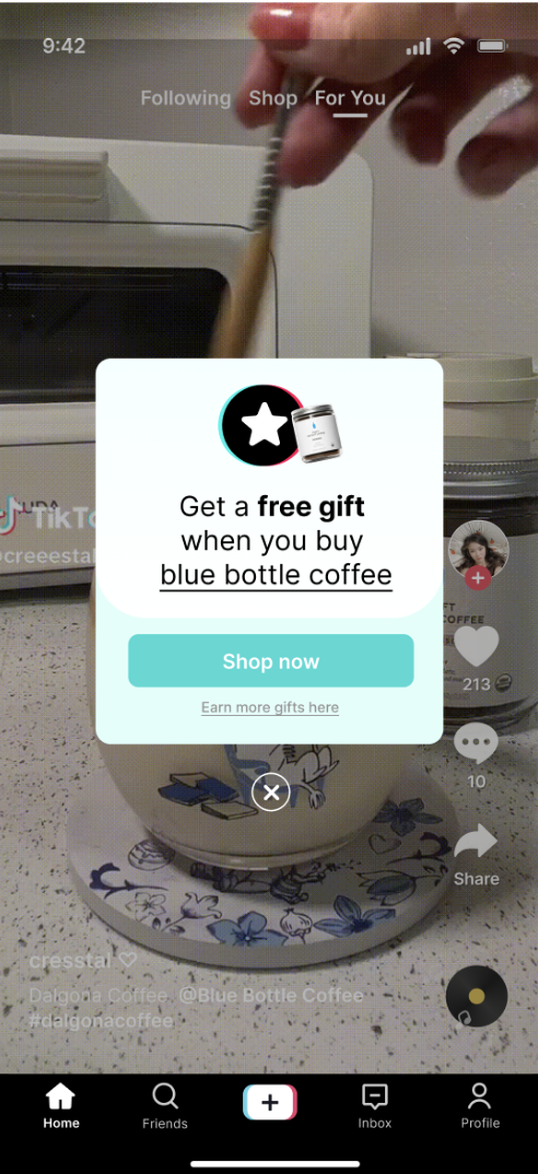
Lastly, Introducing...Tiktok shop Rewards!
To bridge the trust gap and encourage first time purchases, we proposed a rewards system designed to build confidence, incentivize engagement, and retain users over time.
FYP Page: Discovery
Discover Tiktok Shop's new rewards system!
Discover Tiktok Shop's new rewards system!
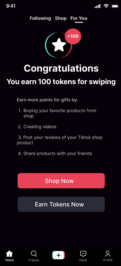
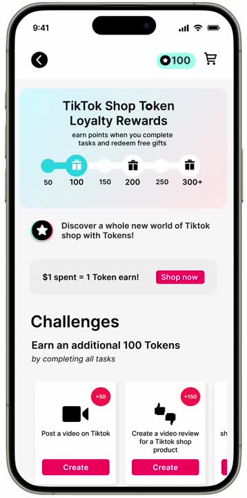
Rewards Page: Engagement
Check out fun challenges, gain Tokens, and earn gifts for free.
Check out fun challenges, gain Tokens, and earn gifts for free.

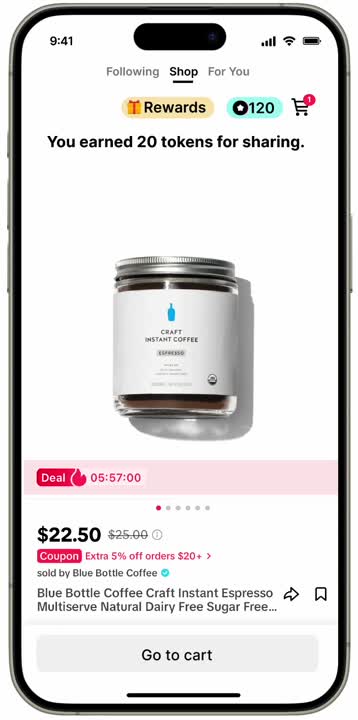
Shop and Share: Social Trust
Buy and share products with friends!
Buy and share products with friends!
Checkout with gifts: Loyalty
Lastly, complete milestones through shopping and earn benefits including freebies and discounts!
Lastly, complete milestones through shopping and earn benefits including freebies and discounts!
Reflection
What I learned
1. Don't follow assumptions: It is okay to pviot. I learned to question my initial assumptions and let user feedback guide the direction. Instead of focusing on earning points, insights showed users cared more about the reward redemption experience, which led us to pivot our design for greater impact.
2. Design with clarity: I learned that even small visual or wording changes can influence how users feel about completing tasks. For example, by simplifying reward tiers and adding clearer progress cues, we made users feel more motivated and in control of their goals. This is something I will keep in mind in my future designs.
2. Design with clarity: I learned that even small visual or wording changes can influence how users feel about completing tasks. For example, by simplifying reward tiers and adding clearer progress cues, we made users feel more motivated and in control of their goals. This is something I will keep in mind in my future designs.